The Best Uniforms in Reds History: A Definitive Ranking
Bring back the pinstripes...and the blue?
My wife, the lovely and infinitely patient Mrs. Dotson, rolls her eyes at me constantly. This is because I say many dumb things. Of course, you — the devoted reader — already knew this and you keep reading my words despite all the dumb things I say (or write). Perhaps you roll your eyes often, as well. I get it. It doesn’t hurt my feelings.
To be more specific, however, my wife rolls her eyes at least once, and for one particular reason, during every single sporting contest that we watch, either on television or in person. It usually happens, early in the game, when I make some comment about the uniforms being worn by one team or the other. I can’t help it. And I have very passionate thoughts about Georgetown Hoyas basketball uniforms.
So yeah, I’m kinda obsessed about what the players wear onto the field of battle. I’ve been a devoted reader of UniWatch for years. (I even have my membership card. See below.) And it’s why I have particularly strong opinions about the unis worn by the Cincinnati Reds.

So this is a piece I’ve been meaning to write for years. The top ten Reds uniforms of all time. Let’s do this!
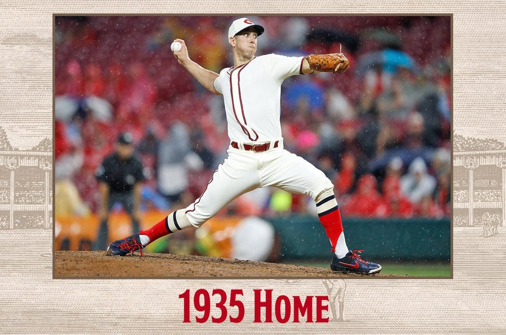
#10: 1935 Home
Not sure why I like these. So simple. No logo and no number on the front. But after seeing the Reds wear them in 2019 (photo above posted by the Reds here), I fell in love with the socks and the clean look.
#9: 1956 Road
In general, I despite the vest uniforms. They all look ridiculous to me. This is the lone exception, because they were the version that Ted Kluszewski — and Derek Dietrich — wore so memorably. Also, they have that sweet terrifying Mr. Red logo on the chest. I couldn’t love it more.
#8: 1919 Home
I don’t love the white caps, but everything else here is great. What is going on with those socks? I kinda love it. Look at the belt loop in the back. Distinctive. I dunno, perhaps it’s just because they won the World Series that year (fair and square) and I love pinstripes. Classic unis.
#7: 1939 Home
As you’ll notice throughout these rankings, I really like the blue accents on some of Cincinnati’s uniforms over the years. I love the clean look of the 1939 home uniforms, the cream base color, the red/blue stirrups, the blue caps. Many of you will disagree. I’m accustomed to that reaction.
#6: 2007-present Home
Cincinnati’s current home uniforms get a bad rap, in my opinion. I think they’re very close to being a classical look, with a bit of a modern touch, that the Reds could wear forever. I despise the drop shadow in all its forms, and the Reds should drop it from their caps and their logos and from everything forever. The Drop Shadow Is The Devil. I’ll accept no argument about that.
Otherwise, these uniforms are pretty cromulent. Eliminate the drop shadow and require the players to wear stirrups, and they’d be in contention for the top spot on this list.
#5: 1911 Road
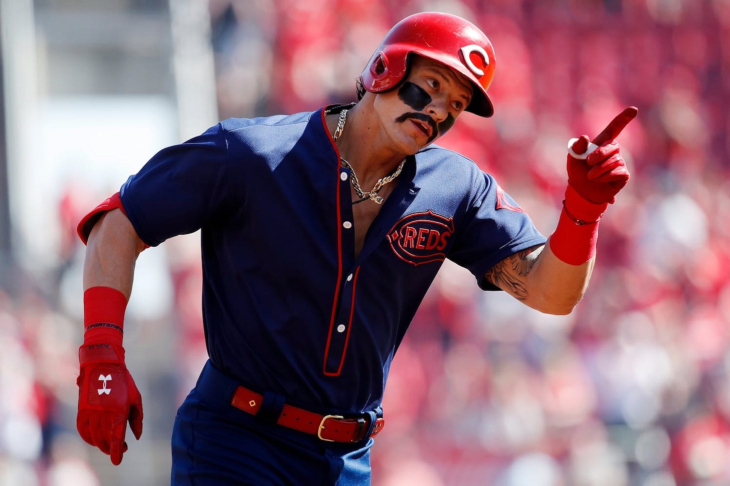
Another uniform where Dietrich is America’s Top Model. I seriously considered making this the number one selection on this ranking, but I couldn’t quite pull that trigger.
I fully expect all of you to disagree with this ranking, but just look at that glorious son of a gun! A team called the Reds wearing a uniform that is mostly all blue, with red accents. I’d vote for legislation that required the Reds to wear this uniform at least once a month in perpetuity.
#4: 1972-1992 Home
My guess is that most of you Devoted Readers will have the classic 1970s Big Red Machine/1990 Wire-to-Wire uniforms at the top of your personal uni rankings. I can’t really argue, since most highlights we will ever watch will have Reds stars wearing these. And I think they’re pretty great, a clean, classic look that feels like the quintessential Reds uniform, even if I don’t love the pullover tops.
Teams like the Dodgers and Yankees lean hard into their distinguished histories by wearing classical uniforms. They don’t change them, by and large. The Reds have a pretty good franchise history of their own, so there’s a good argument that they should go back to these and never change them again. I don’t necessarily agree, but I wouldn’t argue very hard against it. They’re classic.
#3: 1967 Home
I love pinstripes. Just love them, that’s all. I praised the Yankees’ classic look above, and the pinstripes are the key. These are the second-best Reds home uniforms of all time. I love them unconditionally.
#2: 1995 Road
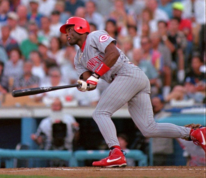
Oh my. These are just perfect road uniforms. Grey, with red pinstripes, and the logo on the left sleeve. These have never been topped, and never will.
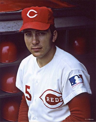
#1: 1969 Home
The perfect Cincinnati Reds uniform. Similar to the Big Red Machine version, but with a button-up top instead of the pullover. Beautiful stirrups. The quintessential Reds cap with no drop shadow. But don’t let me persuade you; just look at this photo of Johnny Bench.
Perfect.
I’ve been pretty consistent on this point over the years. Cincinnati should go back to the 1969 home uniforms and the 1995 road unis permanently.
BONUS: The worst Reds uniforms of all time!
Why not? Worst home uniform was the 1995 version with the hideous vests and the Good Humor ice cream man caps. Just awful, despite the fact that the 1995 team may have been my favorite Reds club of all time.
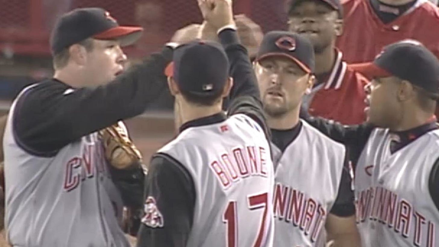
Worst road unis: 1999 Road. Another fun team, but they took the worst elements of the 1995 home uniforms and added all that ridiculous black, including black caps. It just didn’t work.
What Chad’s Watching
Gladiator II was pretty good! Although Paul Mescal was a curious choice for the lead. No matter, Denzel Washington stole the show and is guaranteed a Best Supporting Actor nomination.











Great article! Totally agree.
(and good on you for celebrating Derek Dietrich...he will always be what I picture from that season of celebrating past uniforms....that and being a beekeeper)
I 100% agree with you on your top two choices. Those 99 road jerseys would have been better with the red undershirts rather than the black.